★ Over 400 copies sold
TIMES WordPress Theme
TIMES was a premium WordPress theme that I created back in 2016. It received dozens of 5 star reviews and served many customers. My largest project to date, I’ve learnt lots about layouts in CSS and how people really use WordPress.
The Design
All the pages and components of the TIMES theme were designed by me. I wanted this theme to be an antidote to the news websites out there, full of noise and clutter. With TIMES, I wanted to create a minimal, clean, and legible experience for the reader.
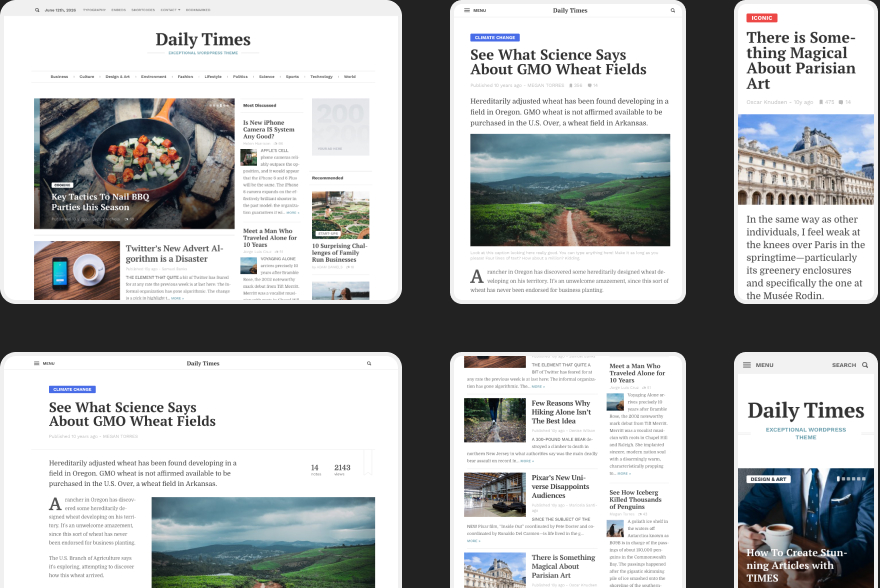
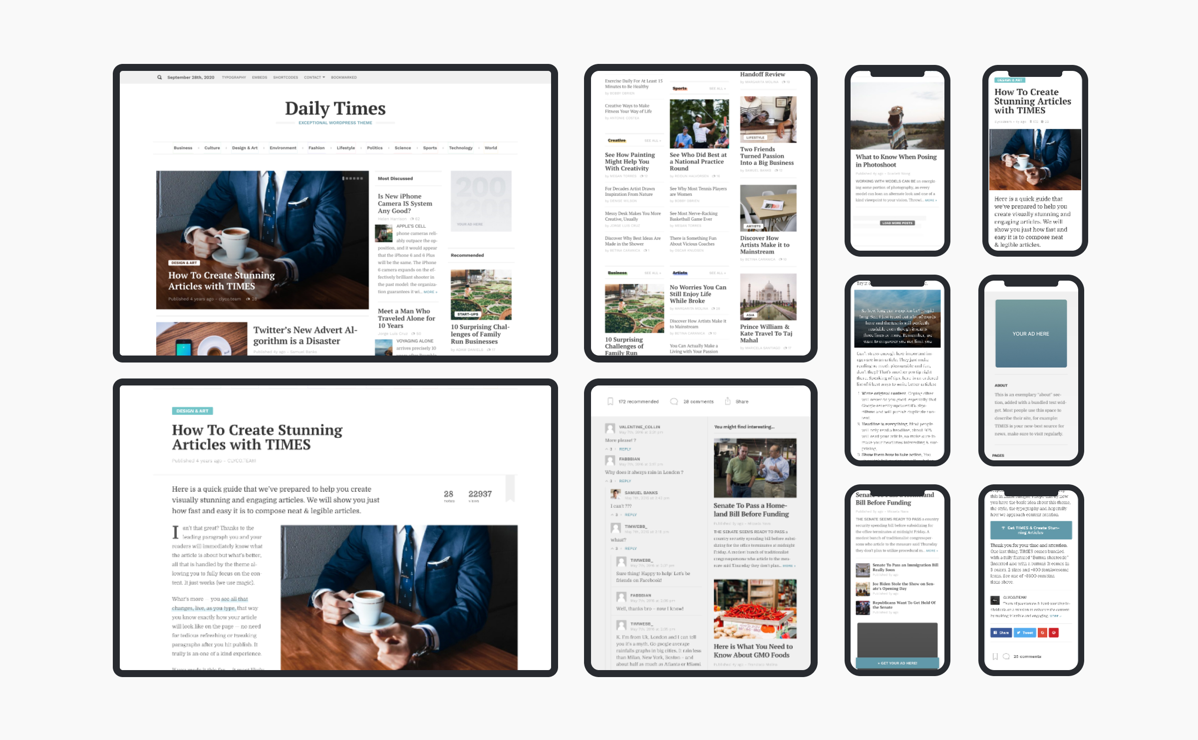
Front page:
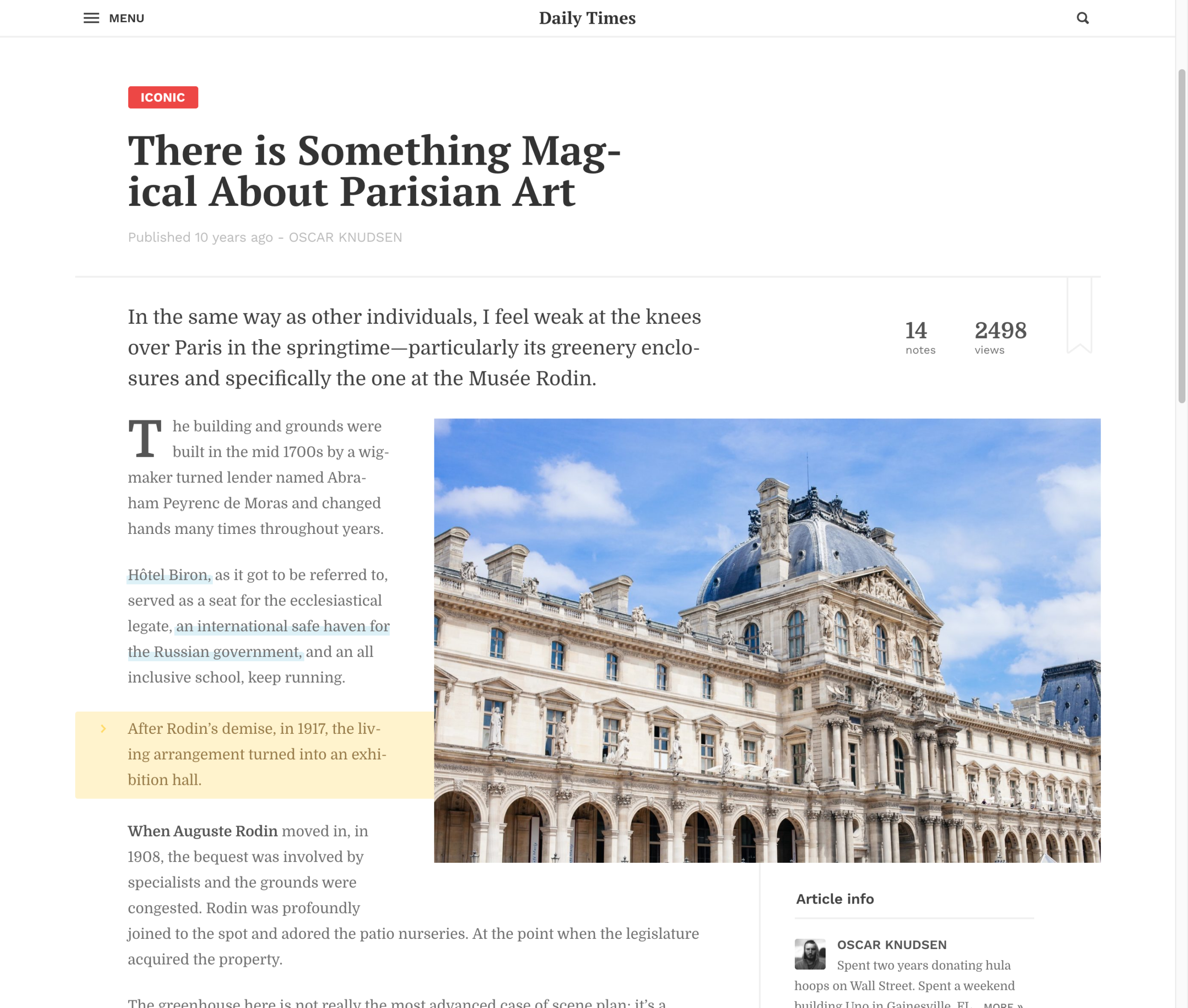
Article view:
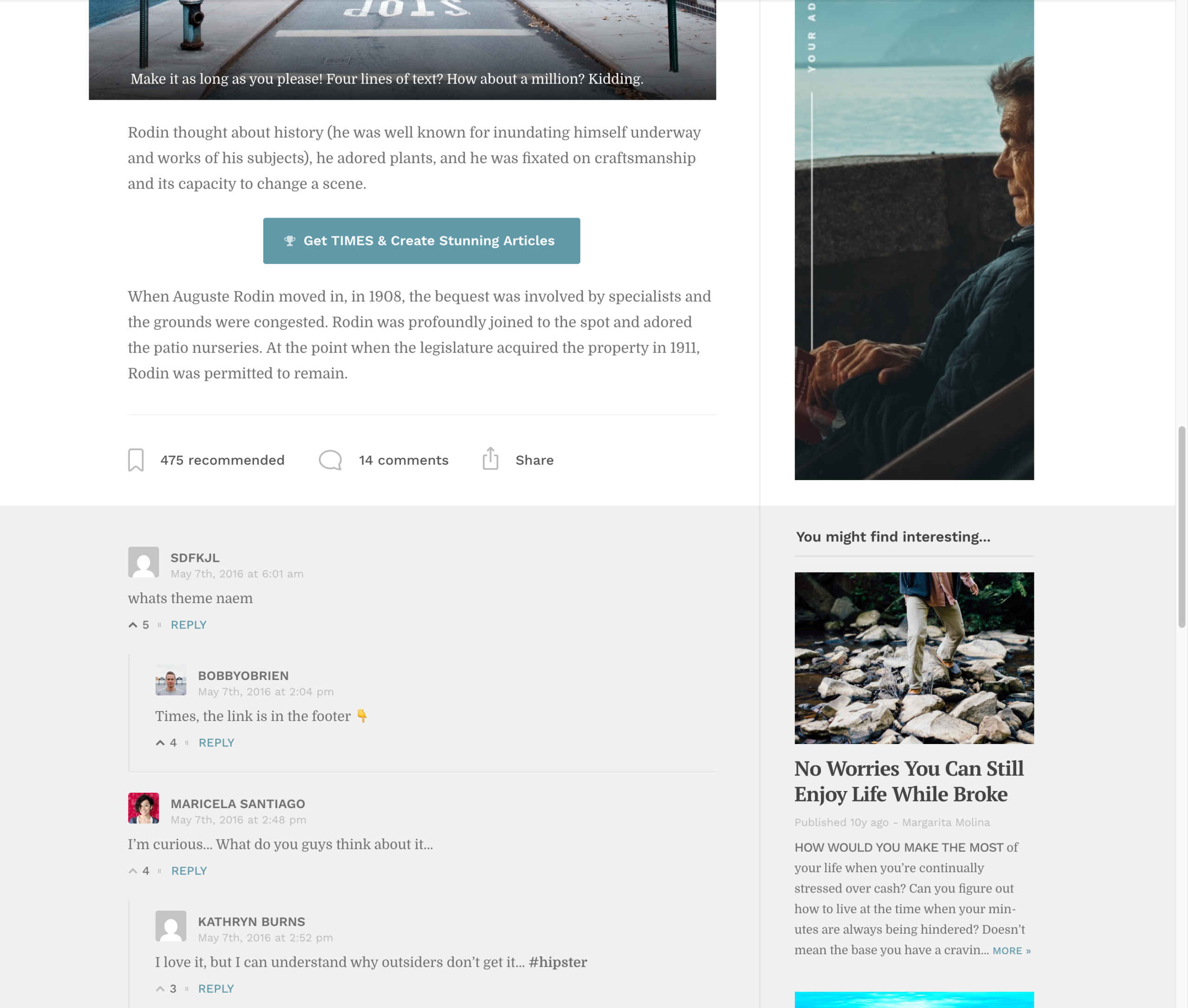
The theme also supported comments and had a custom recommendation system:
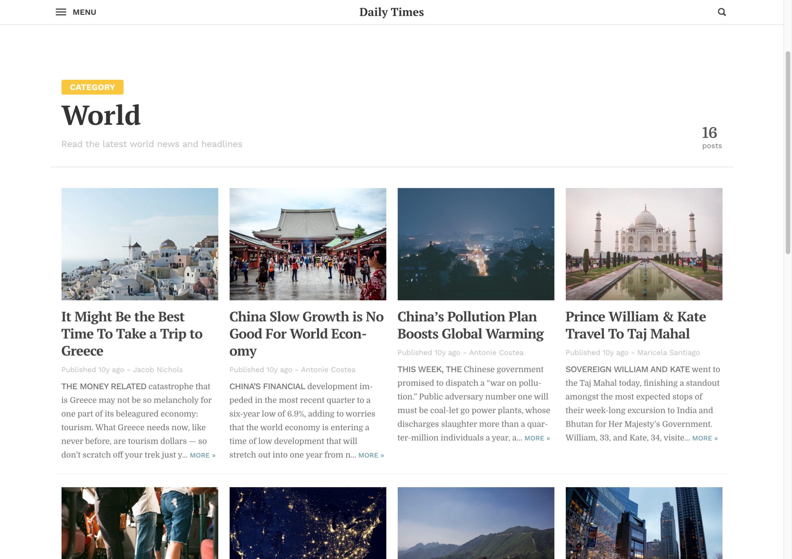
Archives:
Navigation:
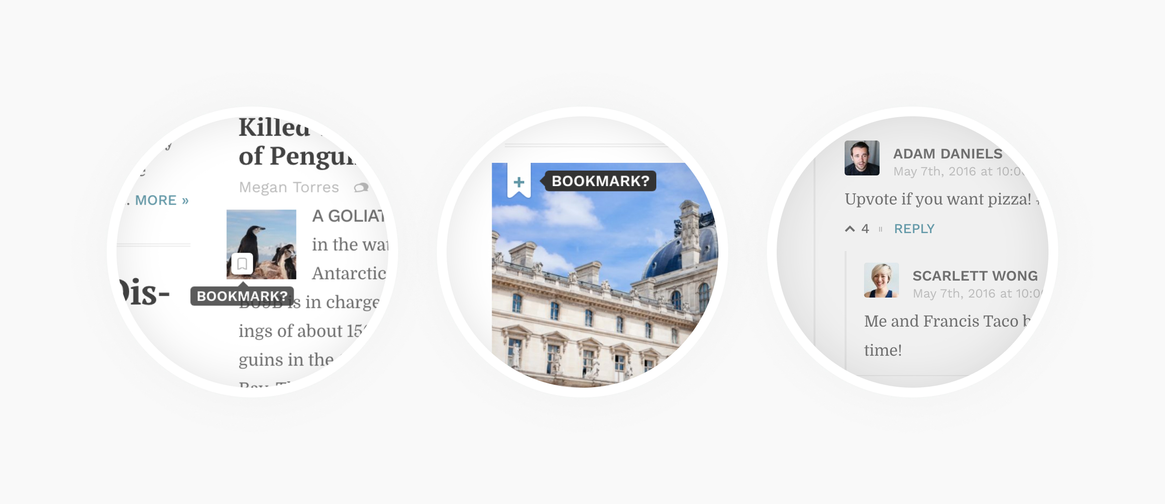
Interactivity
In my view, a truly delightful experience is often created by sweating the small stuff. The theme was peppered with neat interactive features:
Responsiveness
Aside from looking great, the theme had to adapt to every screen size and device from the very start. This was a foundational principle. The code for this theme took a mobile-first approach. And everything scaled from there.
For me, making the theme responsive wasn’t just a case of making everything smaller on mobile. I wanted the experience to be great on a touch-enabled handheld devices as well, e.g. each button had to be to effortlessly reachable and large enough to be easy to tap.
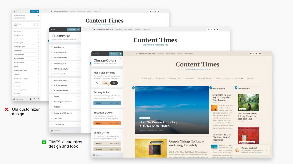
Customisation experience
In order to ensure that the theme could fit any brand, I provided multiple customization options ranging from simple changes to the accent colour and type to starting-of-point colour palettes.
If your website didn’t have any content yet, you could really easily load demo content. This imported images and posts into your site:
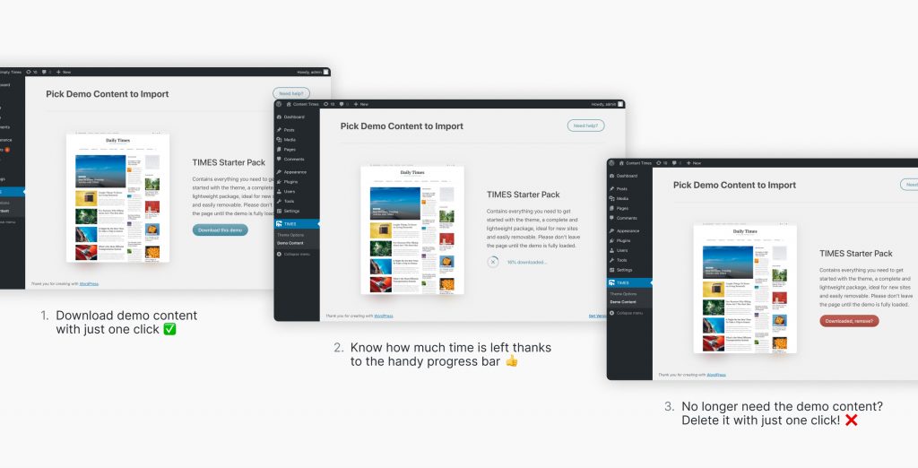
Once you get the hang of how the theme was set up, you could easily remove the demo content in the dashboard. This was done to ensure that the demo content would not stick around and clutter up the interface.
The WordPress experience
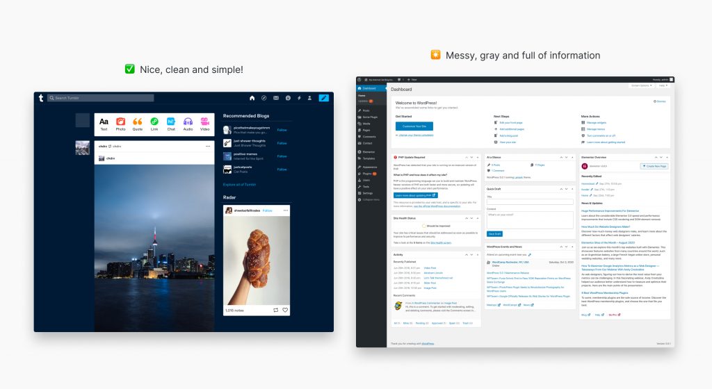
I remember opening WordPress for the first time back in the day. Coming from much more user-friendly platforms like Tumblr, WordPress appeared a bit overwhelming at first. All those notifications, buttons, links, dashboard widgets were a bit much.
After a few tries, I managed to figure out how to get around the platform and get things done. Since then, I’ve learned to love WordPress for the high level of customization and extensive functionality it provides — and sigh over its poor user experience.
This theme was my attempt at improving this aspect of the platform while retaining all the expansibility it provides, in order to create better blogging and content publishing experience.
The problem with most themes
If you ever bought a premium WordPress theme you are most likely familiar with the tribulations of actually installing it. There are often tens of plugins and extensions that you need to install, one by one, just so your website resembles the demo page. Most of them, are from 3rd party developers and won’t integrate fully with your theme, leaving you to deal with all the updates, notifications, advertising and nagging to buy the PRO version. Yuck!
What’s worse, after you’ve installed the theme, you can’t just start blogging, every theme developer has a different way of customizing the features of your theme. Some of the options are in the WP’s native customization panel, some options are available in the settings page or even some other theme generated settings page.
So you have two options. You can either, read the documentation (which in most cases is outdated and not maintained after new features are added) or download the pre-made demo that the theme author provides. For the sake of time, most people choose the latter and download the demo content, which will flood their site with random stock images and sample content that will have to be later excruciatingly removed.
In the end, you’re not really buying a flexible and versatile theme, but a simple template — which is a shame, because WordPress can do so much more. I really wanted my theme to be different than this, to be fully versatile but also highly customizable.
The idea was that the content should dictate how the site looks and that the layout should fluidly adapt to the ever changing content. A theme that one could quickly install and start blogging right away without heavy demo content or the need for long documentations.
Reception from customers
As the creator of this product, I was tasked with providing online support for it. This experience has provided me with so much insight as to how customers actually interact with my theme. I was able to see how my product was used by real, people and how their real content interacted with my designs.
In the best way, this challenged my empathy skills to unlike anything else. With every single question, I try to really put myself into the shoes of the customer and provide only the kind of support that I would like to get. Before I send any email, I always ask myself, “Will this reply help or at least get the customer one step closer to the solution?” I’ll let the reviews reflect whether I did this well.
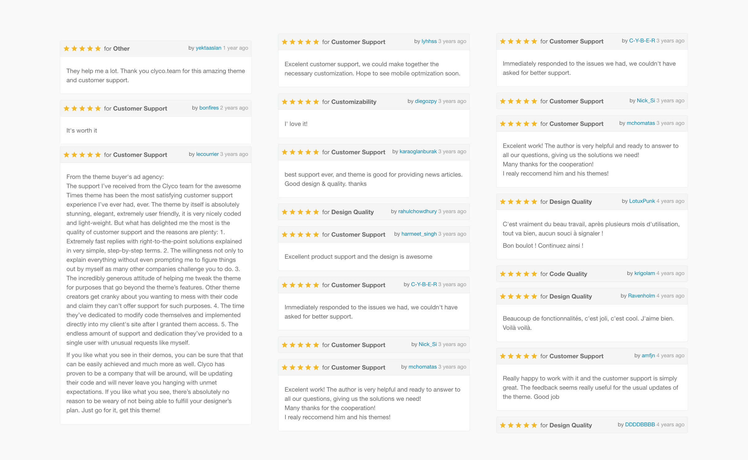
All these kind words made creating this theme an absolute joy. It was a chapter that has taught me so much, and I’m really proud of it.
Get in touch
I hope you enjoyed this case study and revisiting this chapter with me. If you like what you see here and want to get in touch, I’d love to hear from you.