IndyPod
Landing Page Design
IndyPod is an online community and learning platform that helps podcasters develop their skills through expert-led courses and support from other creators.
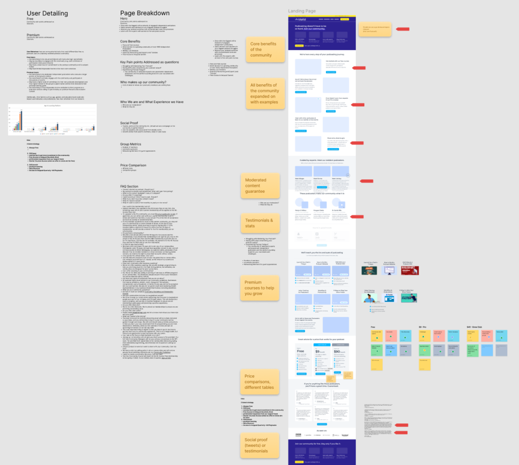
From Brief to Wireframe
The project began with a content brief outlining the messaging, goals and structure of the landing page. I translated these requirements into mid-fidelity wireframes, exploring content hierarchy and page structure before moving into visual design. This process ensured the final design supported marketing objectives.
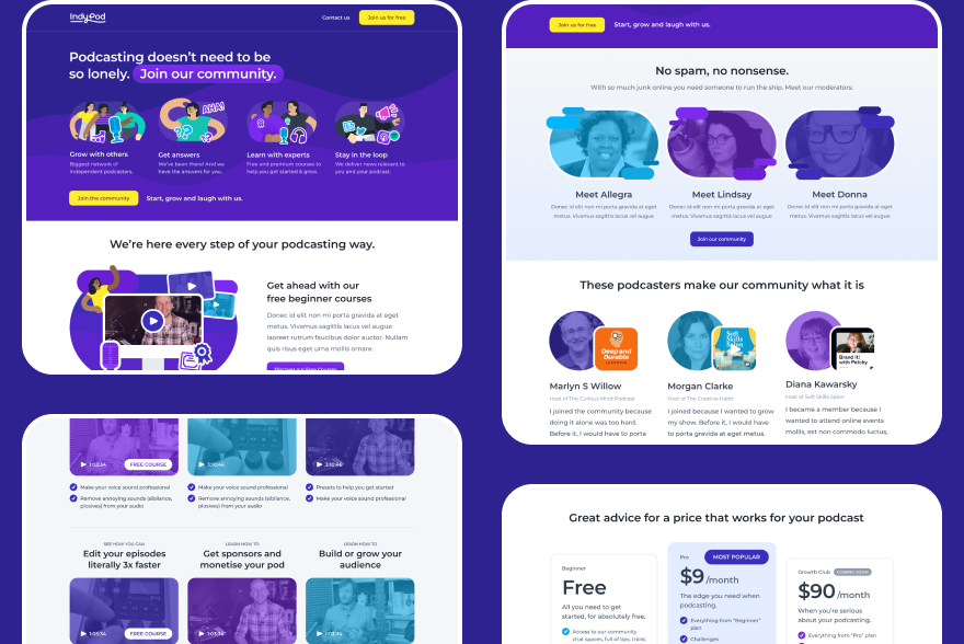
Distinct Visual Style
I developed a visual design that balanced educational credibility with a friendly and accessible personality. Careful attention was given to typography, spacing, colour and hierarchy to ensure content remained easy to scan.
The final design helped communicate the value of the courses and community while creating a polished experience that felt consistent with the wider brand.
Custom Illustrations
To support the content and create a more memorable experience, I designed a set of custom illustrations specifically for the landing page.
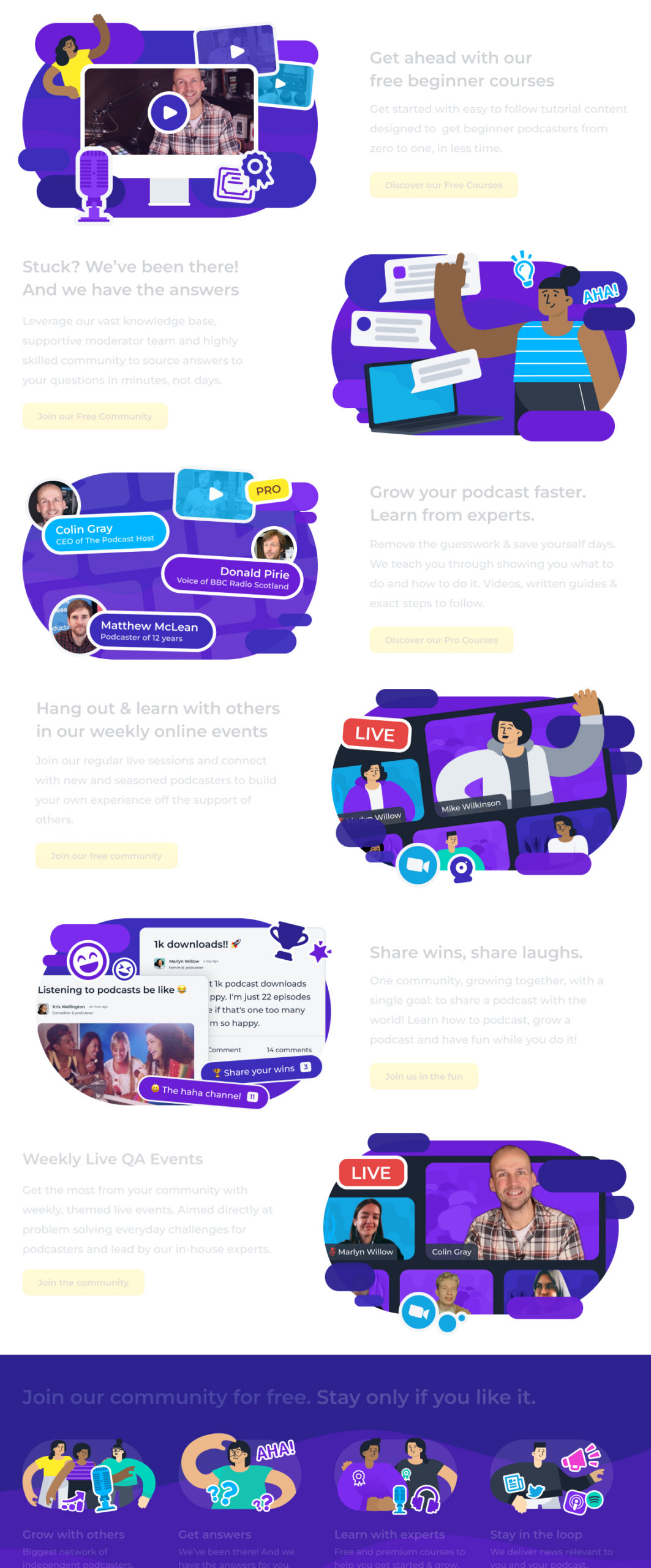
These illustrations helped break up long sections of content, communicate key ideas and add personality to the page without relying on generic stock imagery.
By creating bespoke visual assets, the page achieved a more distinctive look while supporting the overall messaging and user experience.
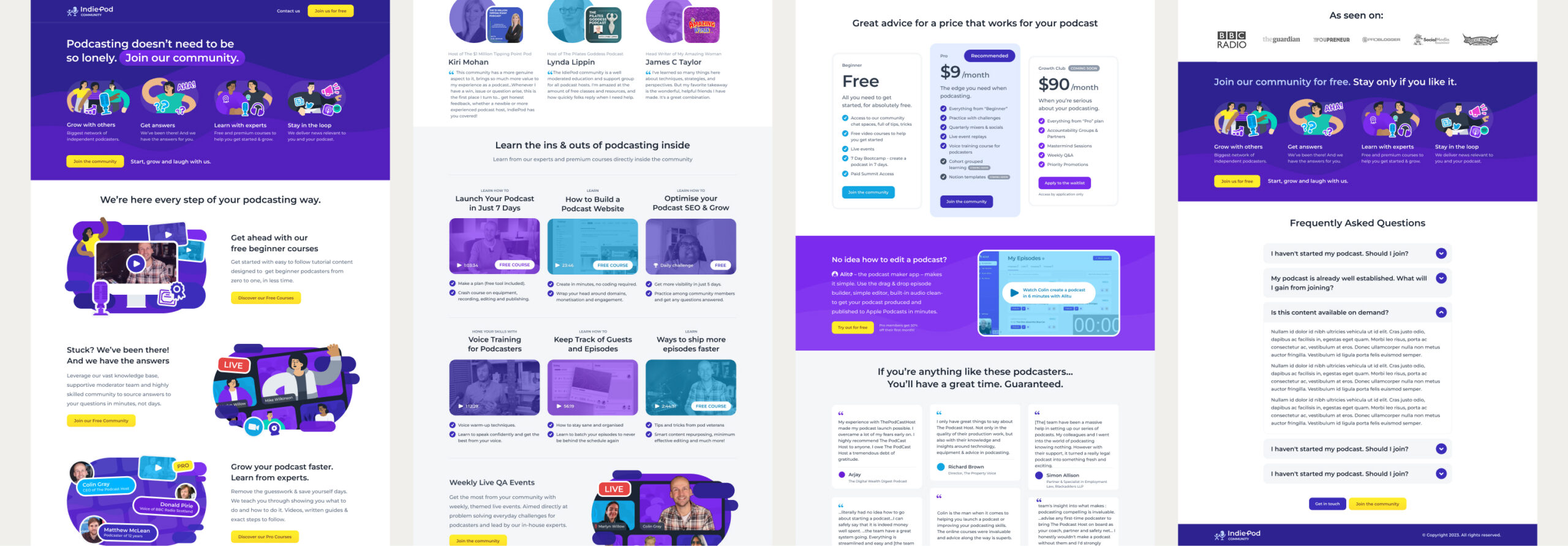
Responsive Implementation
Once the designs were approved, I built the landing page in Webflow from scratch.
The layout was designed responsively from the outset, ensuring the experience worked seamlessly across desktop, tablet and mobile devices. Components and spacing were carefully adapted to different screen sizes while maintaining visual consistency and usability.
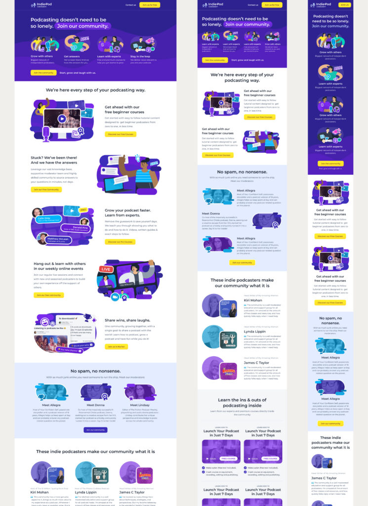
The result was a fully responsive landing page that remained clear, engaging and easy to navigate regardless of device.
Results
The project successfully transformed a simple content brief into a polished marketing experience.
Key outcomes included:
- Wireframes developed from stakeholder requirements
- Custom illustrations created specifically for the campaign
- Fully responsive design across desktop, tablet and mobile
- End-to-end implementation in Webflow
- A visually distinctive landing page aligned with the IndiePod brand
Get in touch
I hope you enjoyed this case study and revisiting this chapter with me. If you like what you see here and want to get in touch, I’d love to hear from you.