foodie
Responsive Recipe Web App
Recipe based web app for real foodies. Front-end built using CSS Grid, Flexbox & vanilla JS with structural HTML, SEO optimization and structured data.
Design and Layout
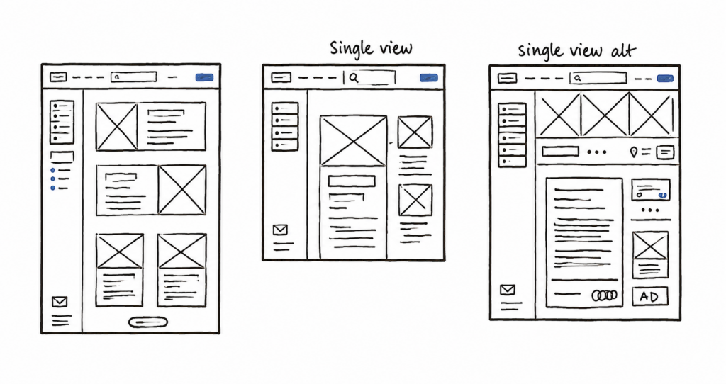
The design process for this web app began with a simple sketch. This mirrors my process. Before I jump into Figma, I always make sure that the structure and content hierarchy is correct. This first low-fidelity iteration helps me better communicate with the client and spot mistakes early.
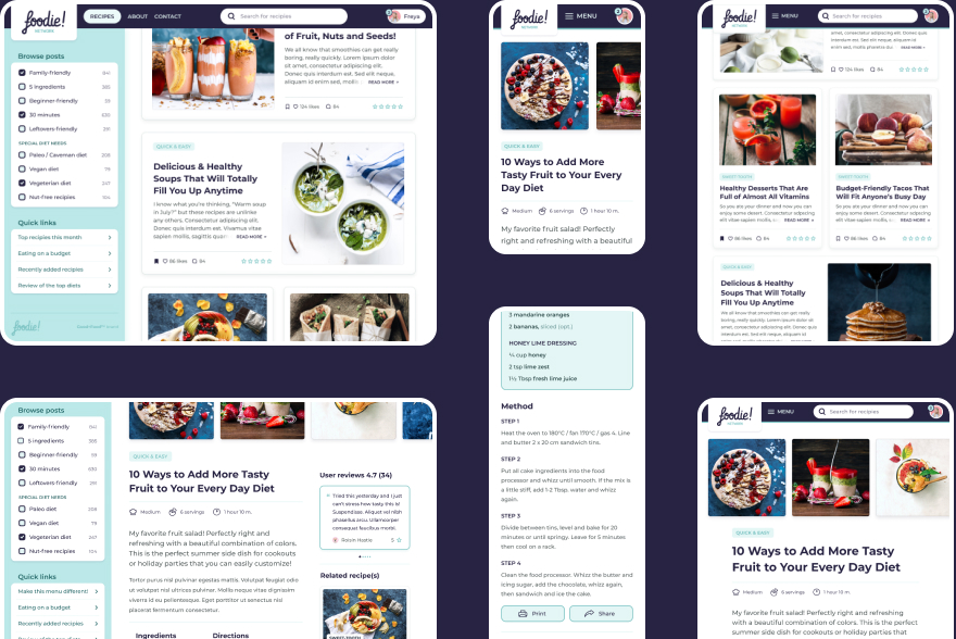
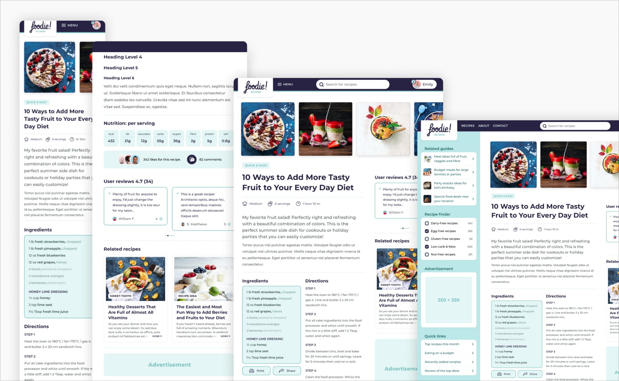
Working from a brand file, I iterated inside of Figma to deliver the home page and the recipe page. This design file featured desktop, tablet, and mobile views, plus the reusable components in all the required states.
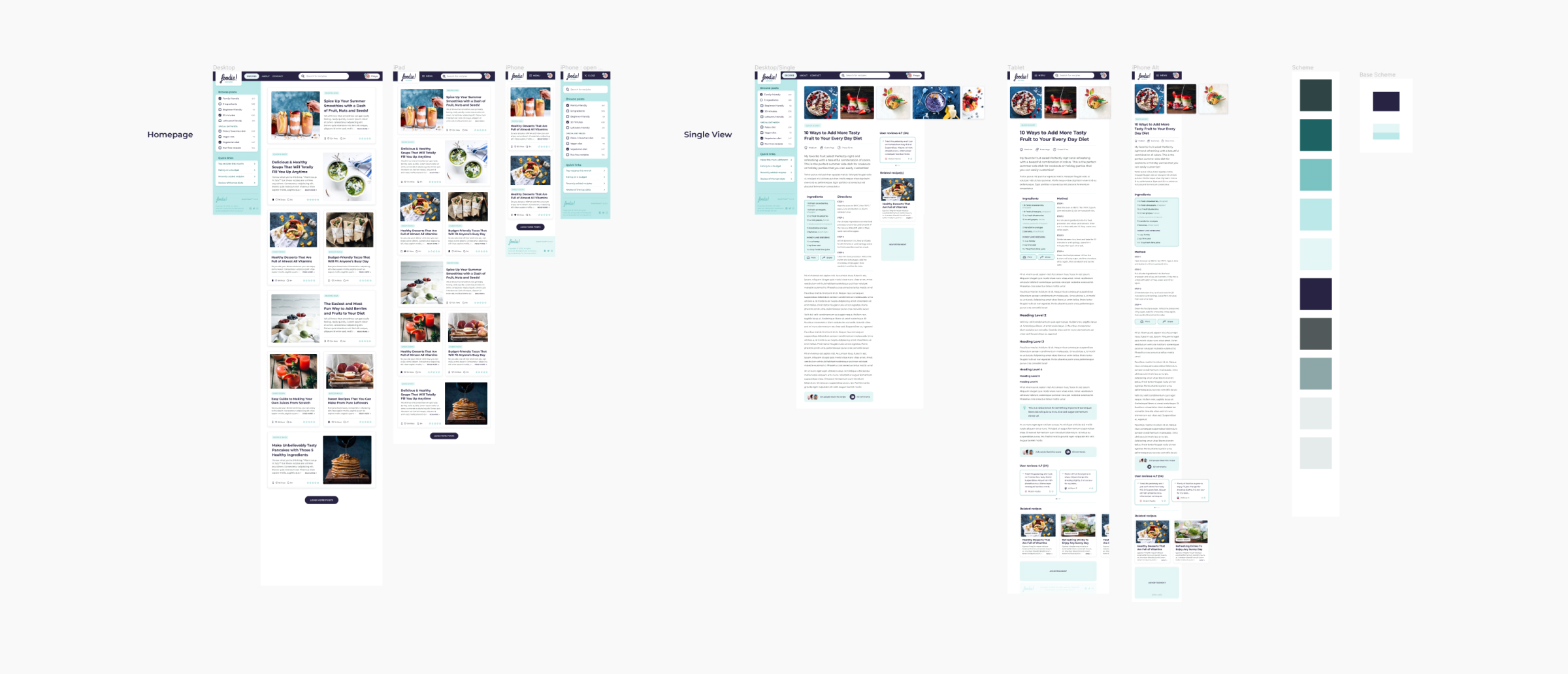
In my view, making sites responsive is not just about making things smaller on mobile. It starts with the design process. I always test my sites on a real mobile device to ensure that all the elements are big enough for the thumb to tap and reachable without much strain.
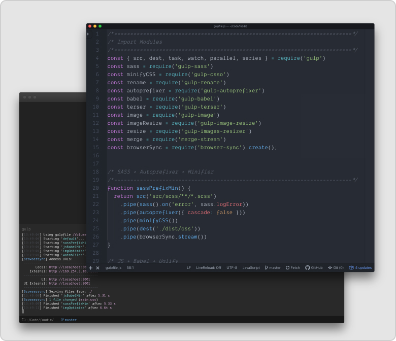
Development environment
This project was created before Webpack and Vite were around. At the time, the best tools to compile SASS and JS was gulp.js and Node. The task runner was used to automate the process of minifying, prefixing, parsing SASS files. I also used Babel to convert ES6 JavaScript and gulp-uglify to reduce the file size. You can see that setup below:
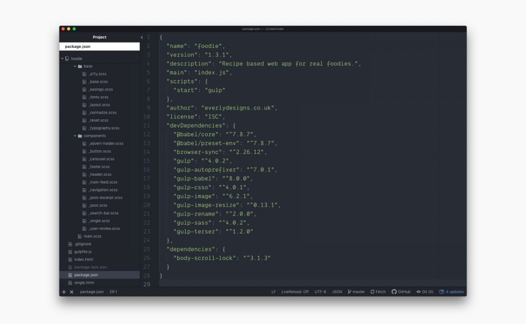
After everything was set up, I began to create and categorize all .scss files according to the 7-1 folder structure. The git repository I created kept track of all the changes and was hosted on GitHub.
Responsiveness
All my websites follow the mobile-first approach to web development. That means, I start styling the elements for mobile devices first and add more code as the viewport gets wider.
In doing so it’s easier to ensure that the mobile version of the site isn’t a hurried after-thought. But it also means that mobile devices don’t have as much code to load and the site loads more quickly.
Semantic HTML + BEM + A11Y
The semantic structure of this web app made use of modern HTML5 principles. For example, header and footer tags were used and headline tags (h1-h6) followed the site structure, instead of just being based on appearance.
This approach also helps makes sites accessible so that people with various impairments can enjoy their content as well. If you’d like to learn more about how I approach accessibility in my projects, please see my WCAG audit of the St Paul’s website.
To help prevent specificity wars, the CSS classes have followed the BEM (Block, Element, Modifier) methodology. Next, following the 7-1 folder structure, I begin the styling part of the website by breaking down every section or module into a separate SCSS file — this makes locating the relevant piece of code easier for others working on the site.
Interactivity and JS
Once the site is styled I then add relevant functionality.
This project uses vanilla JS for all its functionality. Sometimes, my projects require the use of a 3rd party library, like in this case Swiper.js.
I can easily follow the documentation to ensure that the library works well with the site and behaves as intended by the author.
Structured Data (SEO)
As this is a recipe sharing site, it was very important for me that the search engines can understand the content that is published on the platform.
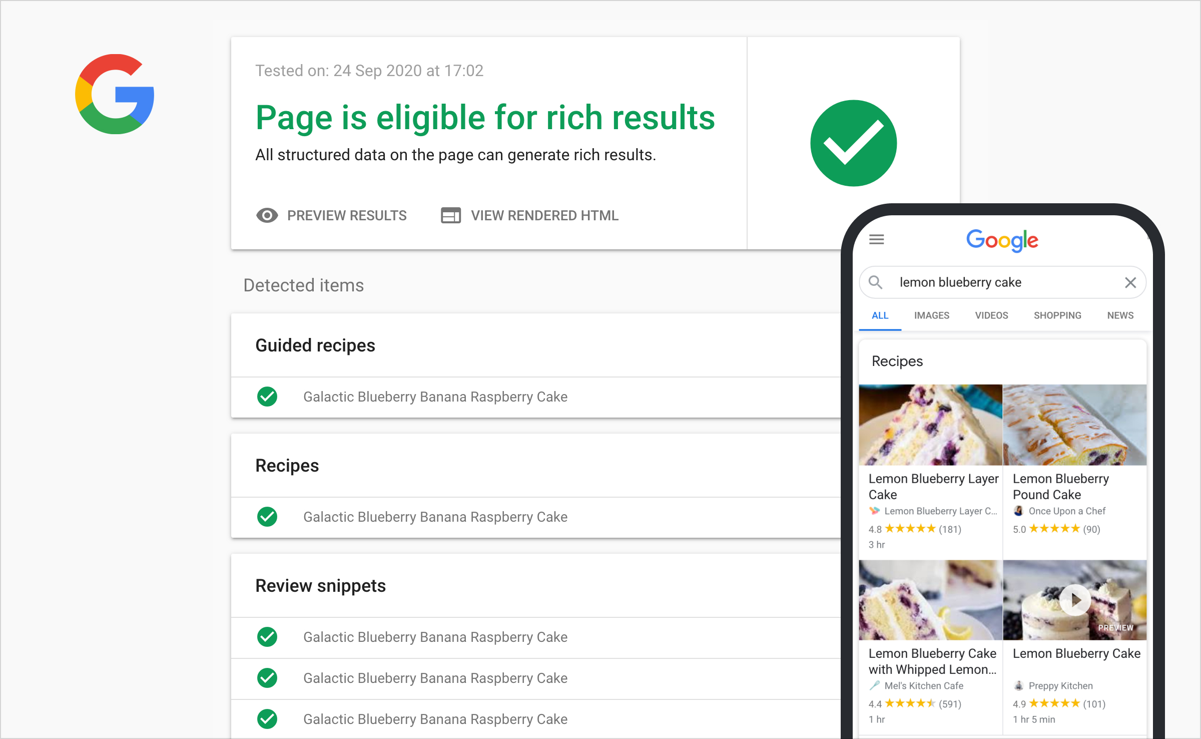
This kind of SEO optimization will not only allow us to drive more traffic to the site but also help our visitors use our recipes on devices like Google Home or Amazon’s Alexa smart speaker devices.
Want to inspect the code?
If you’re interested in this project further, make sure to check out the GitHub repository below. I made this project temporarily public so you can preview any aspect of my code and see if I’d be a good fit for your company:
Get in touch
I hope you enjoyed this case study and revisiting this chapter with me. If you like what you see here and want to get in touch, I’d love to hear from you.