Scope
The audit focused on:
These pages support core user tasks such as planning visits, discovering events and accessing educational resources.
My Role
I independently conducted the accessibility audit, which included:
- evaluating pages against WCAG 2.2
- testing with assistive technologies
- prioritising issues by severity
- proposing developer-ready fixes
Method
To throughly evaluate accessibility I combined automated testing tools, manual review and testing with assistive technologies.
Manual review
- WCAG 2.2 guidelines
- W3C Easy Checks
Assistive technology testing
- keyboard-only navigation
- screen reader (VoiceOver, macOS 26)
- screen magnifier
- colour blindness simulation (Color Oracle app)
Automated tools
- WAVE (browser extension)
- Colour Contrast Analyser (TPGi)
- Chrome DevTools (accessibility panel)
Results
The audit identified 38 accessibility issues across the three pages.
| Severity | # issues |
|---|---|
| High | 9 |
| Medium | 18 |
| Low | 11 |
High severity issues block access to essential functionality and prevent users from completing key tasks. Medium severity issues create surmountable barriers where tasks are still possible but difficult. Low severity issues cause mild annoyance but do not prevent task completion and have limited impact on accessibility.
Five highest impact issues
#1: Visitor information accordion inaccessible
The homepage includes an accordion containing essential visitor information such as opening hours and accessibility details.
Issues:
- the accordion cannot be opened using a keyboard
- screen readers do not announce it as an interactive component
❌ Blocked access for:
- keyboard users
- switch access users
- screen reader users
✅ Recommendations:
- use semantic elements, like
<button>for accordion controls - expose expanded/collapsed state programmatically (using
ARIAattributes likearia-expanded)
Recreation:
#2: Video content inaccessible to deaf users
The Singing Assemblies page contains nine educational videos within a carousel.
Issues:
- captions are automatically generated and often inaccurate
- the carousel cannot be paused or navigated properly using assistive technology
❌ Blocked access for:
- deaf and hard-of-hearing users
- keyboard users
- screen reader users
✅ Recommendations:
- provide human–verified captions that follow subtitle guidelines
- ensure carousel controls are keyboard accessible (marking up the pause control as
<button>tag), or better yet… - consider replacing the carousel with a video grid to make all videos instantly accessible
Recreation:
Notice that:
- pause control is inaccessible,
- there are no accurate captions,
- its difficult to navigate between videos.
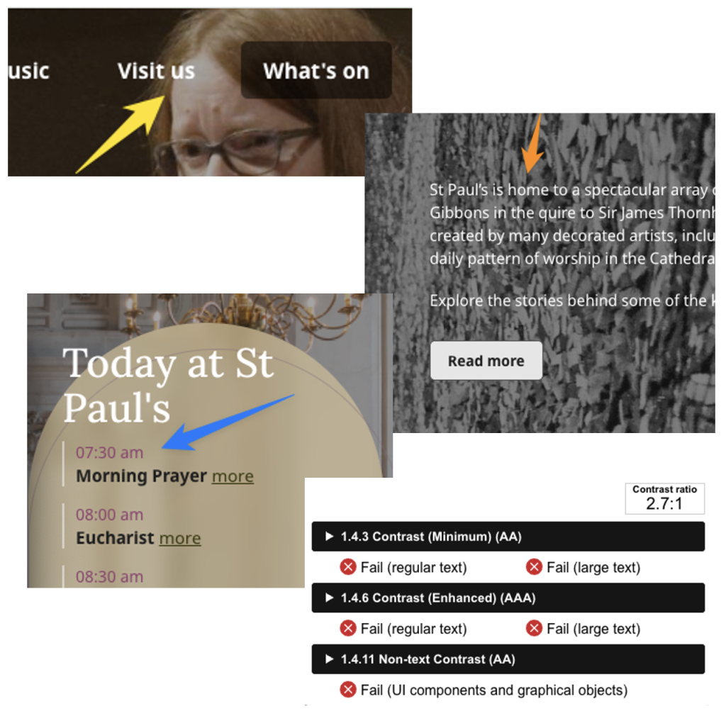
#3: Low text contrast (image backgrounds)
Text overlaid on images does not consistently meet WCAG contrast requirements.
Elements affected:
- main navigation item
- today at St Paul’s hompage section
- hero section content
❌ Impaired access for:
- low-vision users
- colour-blind users
- users viewing the site in poor lighting conditions
✅ Recommendations:
Consider increasing the black colour overlay for images with lighter backgrounds. It’s best to avoid starkly juxtaposed images altogether, but if they can’t be avoided, a subtle image blurring effect can be added to improve legibility.
Examples:
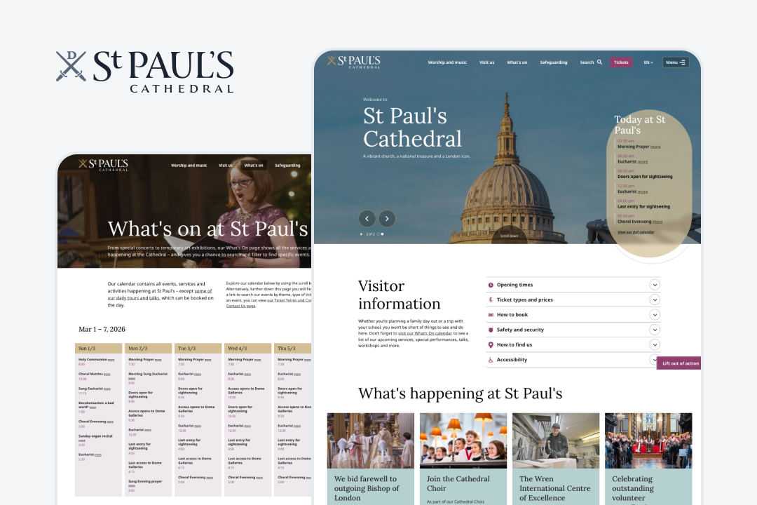
#4: Events table not accessible to screen readers
The events schedule on the “What’s On” page is implemented as two separate tables. Screen readers therefore read all dates first, then all events. Users cannot easily determine which event corresponds to which date.
❌ Impaired access for:
- keyboard users
- switch access users
- screen reader users
Recreation:
✅ Recommendations:
- The two tables should be united into one to create a relationship between days of the week and its events.
- The row containing days of the week should be wrapped with a
<thead>tag. - Each event should be wrapped in
<th>tag individually, instead of all events of the day sharing one cell. This will make navigation between different elements easier - Links to events should be moved inside the cell.
#5: Carousel component navigation difficult with keyboard
Carousel controls have:
- incorrect focus order
- missing focus indicators
Users navigating via keyboard must press dozens of tab keys to move between controls.
❌ Impaired access for:
- screen reader users
- keyboard users
- switch access users
✅ Recommendations:
- Fix focus order by placing the Next & Previous controls next to each other in the
DOM tree. - Elements which are out of view, like inactive slides, should be hidden from keyboard and screen reader users (e.g. using
aria-hidden).
Reacreation:
Reflection
WCAG compliance does not guarantee a usable experience
One of the most sobering findings was that WCAG compliance alone did not guarantee a usable assistive technology experience. While many success criteria were technically met, testing with screen readers and keyboard navigation still revealed serious interaction barriers. This reflects a broader problem: legislation focuses primarily on WCAG conformance, but real accessibility requires testing with actual assistive technologies. To make this world better for people with disabilities, we have to do more than just run a report and test for WCAG.
Complex components often create the biggest barriers
Many of the most severe issues came from complex interface components such as carousels, interactive menus and improperly structured tables. These components frequently break keyboard navigation or confuse screen readers. Proper use of native HTML semantics is critical, but modern websites often rely on third-party components or plugins where accessibility is not guaranteed. In some cases, the best solution is not to fix the component but to reconsider whether it should exist at all.
Automated captions are not enough
Video captions should always be reviewed by a human. Automatically generated captions can be inaccurate and misleading, which undermines accessibility for deaf and hard-of-hearing users. In practice, poor captions can make content just as difficult to follow as listening to a song that gets muted every few seconds—you can argue that’s better than nothing, but is it really?