Summary
Problem: users wanted to reach new audiences on video platforms but felt overwhelmed by the technical process.
Solution: we built a video interface seamlessly integrated into our well-loved audio editing workflow—adding new functionality without introducing complexity or clutter.
Impact:
- Achieved high usability scores (6+/7 SEQ) and 100% task completion across all test flows
- Generated strong beta sign-up interest
- Successfully launched an additional video tier, enabling upsell opportunities and increasing ARPU
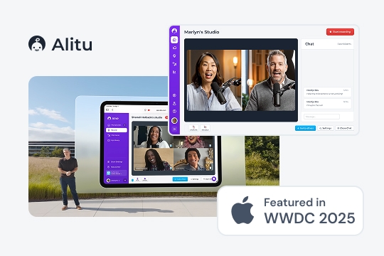
- Contributed to the company’s acquisition by a Y Combinator and Bloomberg Beta-backed organization, alongside a feature at Apple’s WWDC 2025.
User Research
Desk research, which involved speaking to stakeholders, looking through support tickets and our feedback platform, helped set the direction for this research. I followed it up with interviews and then ran a survey to validate the findings. We wanted to see what video features are being utilized by podcasters; what’s working well, and crucially, what isn’t; the different types of video podcasts people create; and what our future direction for video could be.
This research made it clear that there wasn’t just one way to video podcast and the interface needed to be flexible enough to accomodate all the variety out there. We had to improve on what was out there and give podcasters the simple but powerful tools to let their ideas take flight.
Methods
- Desk research
- User interviews (n = 8)
- Survey (n = 128)
Key insights
| Problem | Why it mattered | My design challenge |
|---|---|---|
| Podcasters wanted to get into video but found the prospect overwhelming (they didn’t know what to do to get video ‘right’ and needed guidance on how to create a video show) | Platforms like Spotify and Apple started announcing that they would spotlight video shows and there was an opportunity to get more viewers for a podcaster that way | Build on great audio editing features so that switching to video podcasting feels seamless. Reduce decision fatigue and provide smart defaults to improve learnability |
| There were multiple ways of doing a video podcast (some had access to a studio, some just recorded video calls, some didn’t want to show their face but show slides) | Contemporary video editing software was not well equipped to handle those different ways of creating podcasts well and therefore often got in the way costing the user time. | Design a flow that supports different ways of creating a podcast without the interface becoming too complex, enable dynamic editing that doesn’t get in the way |
| Users avoided video entirely due to perceived complexity of editing tools | This would often prevent podcasters from starting and benefitting from new audiences and opportunities | Layer complexity with progressive disclosure so the interface appears simple while remaining highly functional. |
| Users wanted their podcast to be on-brand and professional but often didn’t have any experience creating intros. | Podcasters rely on their brand to build authority in a given domain, and to network or acquire listeners. Consistent branding is essential in this. | Conceptualise a mechanism that allows anyone to quickly inject their brand into the episode while providing helpful constraints to avoid overwhelm. |
| AI tools often got in the way, permanently altered audio or users complained there was little control over changes | GenAI offers noticeable productivity-boosting opportunities but when done incorrectly, badly designed AI systems can often slow down, frustrate or reduce trust podcasters form this time-saving tech | Design AI-supported interfaces in a way that makes it clear the app allows for human oversight and supports non-destructive editing and undo. |
Analysis
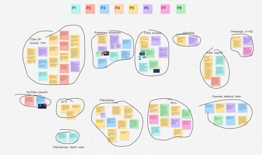
After carefully designing a screener to surface podcasters who have at least a few months worth of video editing experience, I hand-selected eight podcasters to interviews based on their show. Each show was of different type which gave me really rich insights on how video podcasting is done. I was constantly surprised by the variety of ‘video podcasts’ out there and what met the criteria.
By actively listening to the recordings, I extracted compelling user stories that highlighted key behaviours and pain points. I then clustered these observations into distinct themes, allowing me to identify broader patterns and uncover actionable opportunities.
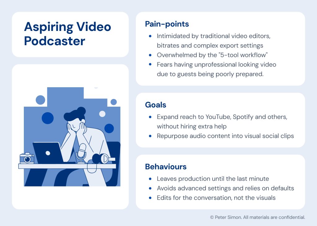
Persona
To ensure the design remained deeply rooted in user needs, I developed a primary persona to anchor the project. By clearly mapping their unique goals, behaviours and daily pain points, this archetypal user served as a constant touchstone for me and the team.
Validating Findings
To validate the findings from the interviews and get a better sense of what truly mattered to podcasters, I decided to create a survey. It was posted on blog with advice on video podcast so we got to survey a wide array of podcasters. After crafting the perfect copy to entice people into participating we’ve gotten a staggering 128 unique responses.
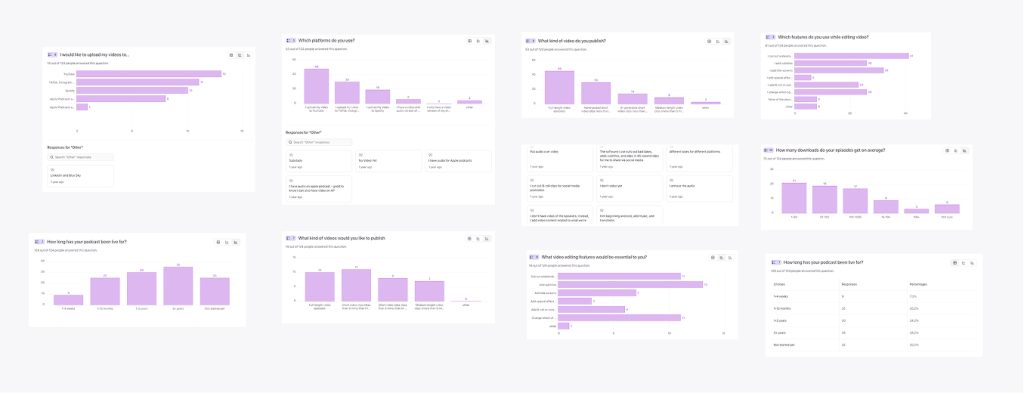
The data showed that, while there seemed to be a big demand for podcast clips, only 58% of podcasters wanted to create clips. Furthermore, 76% of those hand-picked their clips, while others relied on AI, showing that human oversight still dominated. This finding helped us inform the roadmap; we focused our efforts on providing the best episode editing tools and left the AI generated clips to the competition—the feasibility and desirability just weren’t there for us.
Furthermore, the numbers showed us that editing should be limited to basics, like cutting out boring bits to controlling the narrative or muting background noise. There was little demand for effects and transitions the likes of CapCut could facilitate.
Another important finding showed that the average podcaster submitted their podcast to a wide variety of platforms and social media, with YouTube, TikTok, Instagram and LinkedIn dominating. The interviews further revealed that each platform required different type of captions, that is podcasts shared on LinkedIn demanded a different tone than those shared on YouTube.
Business Goals
As platforms like Spotify began prioritising video, podcasters gained a new opportunity to reach wider audiences. We wanted to help them capitalise on that shift while also driving upsell to our video tier, increasing platform stickiness, and improving ARPU (Average Revenue Per User).
Conceptual Design
This discovery work was foundational. I knew I’d have the hard task of accommodating different podcasting styles that I’ve discovered while making sure we do not make the experience worse for audio podcasters who might not care about video (some people didn’t like the prospect of appearing on camera).
The early concepts explored how video could be integrated in to the current audio workflow, without adding extra complexity or removing anything from the audio experience.
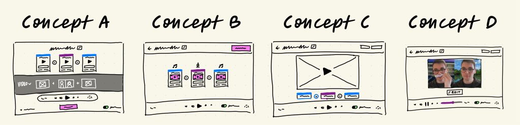
The fat marker sketches helped me visualise different ways of doing that and simultaneously talk through technical constraints and feasibility with the engineering team. This helped me ensured that the designs were feasible and on scope from the very beginning.
Staying on brand
One of the early challenges we wanted to tackle to help podcasters stay on brand was to give them a simple interface to create intros for their podcasts. We also knew some podcasters like to display images when talking about a particular subject. I endeavoured to create an interface that would help support both of those goals.
The challenge here was to help podcasters stay consistent and save them time. We wanted to pull their artwork from their show data so that the user wouldn’t have to manually upload the artwork every single time. We also wanted them to be able to use their episode artwork, which is different from their show artwork, to brand individual episodes. Some users also wanted to show a particular 16:9 intro image that they had designed, so the interface had to be very flexible, but also constrained in a helpful way.
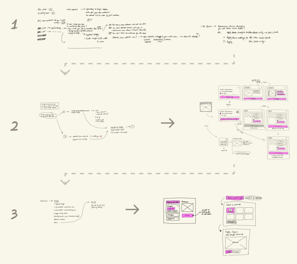
The breadboard above helped me create an experience that met all those goals in just three steps. I iterated in this low fidelity manner until I got a solution which the engineers and I were happy with. This helped save time and ensured the flow was right before I dove into Figma.
Holistic Experience
Another goal of this design was to streamline the workflow so that podcasters only needed one tool to create their video episodes. I was also acutely aware that this solution would live amongst all the other features we already had in the app, and the flow I designed had to fit into that holistically. During my research process, I decided to zoom out and map all the steps a user had to take in traditional software and think how we could do better. I then created two artefacts:
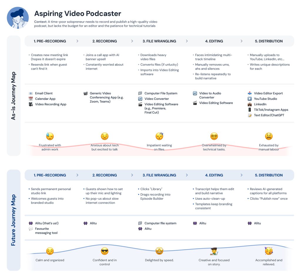
The ‘as-is journey map’ showed the existing steps a podcaster had to take along with common bottlenecks and pain-points. The future journey map then took those into account and allowed me to envision a better flow.
Final Solution
Finally, the wireframes, prototypes and artefacts were brought together to create a cohesive flow. A user would start their journey in our call recorder. The video recording would then be instantly added to their Library to be edited later.
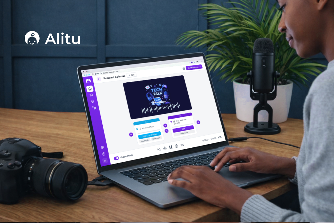
The system we designed uses blocks for individual segments of the podcast. And the intro music could be one block. The interview could be block that can then be split into several other segments that are also visualised as blocks. This block-based editor made the entire process seem less overwhelming for novice podcasters and allowed them to see their episode at a glance.
In the video above, you can see a user bringing in their intro music and adding their interview. We visualise any audio asset as an intro clip containing the podcast artwork, thus keeping the episode on brand. This is an effortless way to add sonic and visual branding to a podcast.
Any block in the episode can be customized and replaced with either an image or the podcast artwork, allowing a host to place an image over a specific segment of a podcast. For example, if hosts are talking about a new video game, an image of that game could be shown. This simple to use block-based editor can be used to create all types of podcasts. Even a podcast that is made up entirely of audio can be converted to video podcast this way, giving any podcaster a simple way to break into the video platforms without the overhead traditional video editing tools have.
And lastly, a user can remove any mistakes from their video by going to the Editor. The user has the option to edit the clip using the transcript, selecting any segment of the podcast to remove it—just like they would a text document. Or they can have a look at the waveform and mute any ums and ahs. The editor itself can have its own case study. So feel free to reach out if you’d like to learn more about how I went about designing it.
Results
- The feature achieved excellent usability metrics, with a 100% task completion rate across 14 usability tests. The Single Ease Question (SEQ) score for the video episode building flow averaged 6.6/7, while the publishing flow scored 6.7/7.
- Led to the company being acquired by Bloomberg Beta and Y Combinator-backed SF company.
- The end design was featured in Apple’s WWDC 2025.
Business Impact
| Goal | Result |
|---|---|
| Maintain simplicity even with a complex video workflow | The SEQ scores for all flows were excellent (6+ out of 7) along with perfect task completion. |
| Consolidate a 5-tool workflow | Tools needed: 5 → 1 |
| Increase ARPU by creating new video tier | Functionality justified addition of a new tier which enabled an extra 9$ of value per customer, per month. |
Next steps
The research conducted reveals that the podcast publishing space is still not very well served. There are already a lot of players dominating the AI clips market and competing with them would require significant resources. Additionally, my findings show that the underlying AI technology is still not good at selecting the right clips. But there aren’t many players solving the problems of publishing and distribution.
Therefore my next recommended step would be to design a platform that automates publishing to different platforms. It’s my belief that the problems are severe enough to warrant a new feature. Such a platform could remove tediousness from the entire process, as publishing could live in one platform, but also save them from tool switching, which can be mentally draining and time-consuming.